Picking colors for new paint… again
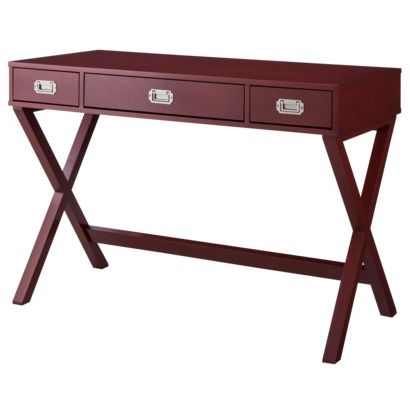
Shortly after we moved in – a whole year ago! – as is customary for anyone settling in to their new space, I stuffed my cart to the brim with home goods at Target. Among the less necessary things I bought were an adorable campaign style X-leg desk I had been eyeing for a while – in red, of course – as well as some new toss pillows that I believe are no longer available, though they do have others in similar colors.
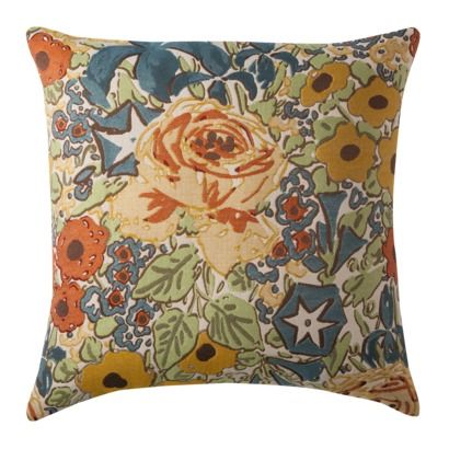
The pillows have all sorts of color in them and have been that illusive linchpin piece to tie all my eclectic pieces together. Pale and olive greens, teal and navy blues, reds, oranges and yellows; they have everything.
I dragged one of these pillows to the paint store and found chips to match the colors I wanted. Now I carry them around in my wallet just in case I see a sale on rugs or something… I mean, I have to make I can at least avoid clashing with things we’ve already purchased.
Even though we’ve already painted several rooms once (or twice, in the case of the living room and hall), I now have a cohesive design plan for the colors downstairs. It takes a little extra work when you have this many rooms looking into each other to ensure the color of the room your in doesn’t clash with the room you’re looking into. The diagram below roughly shows what rooms in relation to each other in size and location, as well as their corresponding colors. My only real concern is the dining / breakfast room transition, but the breakfast room has white trim like the kitchen so it should be alright. If not, a grayish-eggplant will do nicely and will tie into the “new” dining chairs.
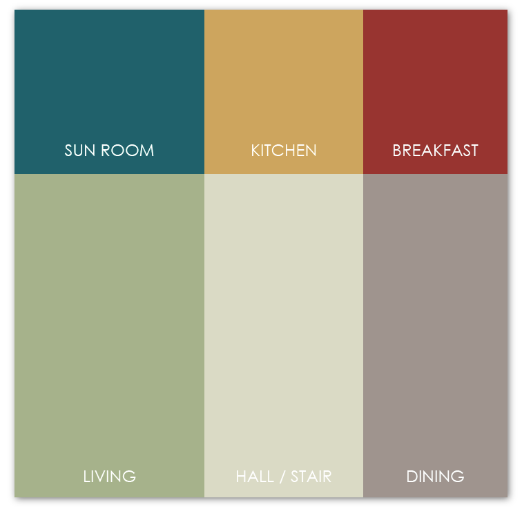
- Hall / Stairwell: Beige-gray – to avoid clashing with anything upstairs
- Living Room (which I want to start referring to as “the salon” or “(with)drawing room” because it sounds so much better): Olive green – a historical favorite
- Sun Room: Teal – not to be confused with turquoise but rather the rich version, the sort of the navy blue of blue-greens
- Kitchen: Ecru yellow – another historical favorite
- Breakfast Room: Bright brick red – or I’ll luck out and get to do that eggplant color
- Dining Room: Taupe
I would like to find a wallpaper for the kitchen. With so little exposed wall space I’d love to do a yellow background Chinoiserie wall covering that incorporates the colors of the other rooms. But until I find it, goldenrod it is!
This also leaves two spaces unplanned: the powder room and barrel ceiling foyer. Both rival a phonebooth for the prize of smallest occupiable space and neither have to tie into any other rooms since their doors are usually closed so the possibilities are pretty endless.
For now, however, I’ll focus on the rooms where I know what I want. Because it will take the most confidence, I think I’ll start with the sun room first. Stay tuned!